Etiology of a Graph Fiasco: How Grievous Misinformation about Adolescent Suicide Spread to the National Academies Press
The origins of the egregiously erroneous Figure 1-4 in a recent Academies report illustrate how easily can factual falsehoods propagate to mainstream media and even esteemed scientific institutions.
A recently released National Academies consensus study titled Social Media and Adolescent Health features prominently the following graph early in the report:
The story of Figure 1-4 serves as a warning that gross misinformation about adolescent suicide can be spread by mainstream media and even esteemed scientific institutions.
An Antidote to Concerns about the Adolescent Suicide Rise
Figure 1-4 accompanies a section of the Introduction where the National Academies report questions the notion that the current deterioration of adolescent mental health constitutes a crisis and where it portrays recent suicide rises among adolescents as unremarkable in view of both historical and adult suicide trends.1
It is easy to see why Figure 1-4 plays a central role in this early section of the report that sets the tone and attitudes of the study: in the graph the recent suicide rates appear to be far below those of three decades ago.
The journalist Eric Levitz wrote this about the graph when reprinting it in the New York magazine’s Intelligencer:
Viewed in historical context, the past decade’s increase in the teen-suicide rate looks less remarkable than that rate’s collapse in the early aughts. In other words, perhaps teens today aren’t exceptionally troubled so much as teens 20 years ago were exceptionally well. […]
The overall teen suicide rate in the U.S. remains far below its 1990s peak.
Many people have no doubt reached similar conclusions when they saw Figure 1-4 in the National Academies report. Many viewers of the graph may even interpret the graph to signify that current teen rates are near ‘normal’ suicide levels.
A Grand Delusion
Any complacency about adolescent suicide based on Figure 1-4 is, however, the result of an illusion caused by a huge error in the graph.
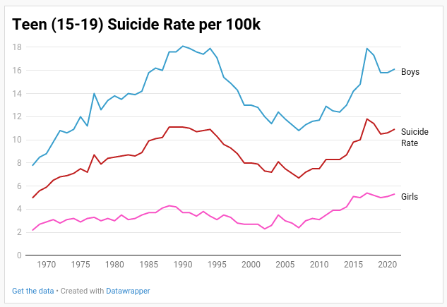
In reality, the actual 2017 rate of 11.8 suicides (per 100k aged 15-19) is above the 1990 peak at 11.1 and teen suicide rates have remained high ever since.
In reality, the rapid decline from 1994 to 2007 (4.5 points in 13 years) is not as remarkably steep as the even quicker rise from 2007 to 2017 (5.1 points in 10 years).
In reality, the correct graph for age 15-19 teens should look like this:
Pathology of Error
Why is there a huge error in the graph?
The answer is simple:
While rates from 1968 to 1998 are correctly (per graph legend) for teens aged 15-19, the rates from 1999 to 2021 are incorrectly for teens aged 13-19.
Suicide in early adolescence increases exponentially with age and so suicide rates of kids aged 13 and 14 are far below the rates of older teens. This is especially true for boys.2
That explains why there is a huge drop between 1998 and 1999 of 4 points from 14.3 to 10.3 for boys on the graph (the actual rate for ages 15-19 in 1999 was 13.0). And this explains why the recent rates appear to be far below those of 30 years ago — it is like comparing apples and potatoes.
Forensics of Error
Why did this huge mistake occur during the creation of the graph?
The erroneous graph was created by Will Rinehart, a self-described ‘Economish and tech policy wonk’ who is a Senior Fellow at the American Enterprise Institute. Rinehart featured the graph in an article titled Thoughts on what the CDC YRBS data means for social media, teens, and mental health that he co-wrote with Taylor Barkley3 — it was published on Barkley’s Substack site Now+Then.
Rinehart has not responded to any of my inquiries, but it is easy to deduce the steps that led him into making the huge mistake.
To get suicide data from the CDC WONDER site, Rinehart had to make three separate inquiries corresponding to ICD 8 (1968-78), ICD 9 (1979-1998), and ICD 10 classifications.4
Rinehart evidently first obtained ages 13-19 rates from the most recent CDC data (ICD 10). Some time later Rinehart decided to also look at late 20th century suicide trends but this time obtained rates for age group 15-19, forgetting that his post-1998 rates are for age group 13-19.
So far this is an understandable mistake that anyone could make. The story, however, develops in a less comfortable manner.
Scotoma of Error
We all make mistakes but in science we need to be especially vigilant to observe any clues that an error occurred.
The first major clue for Rinehart was the fact that in his graph there are massive declines — such as the huge drop of 4 points for boys — in 1999, the very year of the switch from ICD 9 to ICD 10 classification.
When one is splicing data from different ICD classifications, one should ask — and investigate — if the classification changes impacted the data.5 One should do so despite the absence of suspicious results; Rinehart failed to investigate despite the presence of a huge clue. Had he investigated, he’d have no doubt realized the problem is actually not the change in ICD classification but his own mistake regarding age groups.
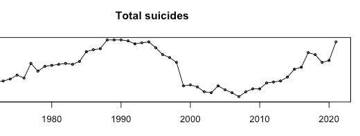
Rinehart had yet another major clue that there is something wrong with his graph. In the Substack article he provides a link to his Github site; that page contains another graph of teenage suicide trends:
See the sharp spike in 2021? That’s because Rinehart’s spreadsheet contains data for 2021 that he obtained after obtaining the 1999-2020 data and so it is (correctly) for ages 15-19, not (incorrectly) for ages 13-19. Therefore 2020-21 has the opposite error of 1998-1999: instead of a huge false decline, there is a huge false increase.
Now of course there were no headlines about huge teen suicide increases in 2021, because there were no such huge increases.6
So what did Rinehart do? Rinehart evidently decided to ignore this obvious discrepancy with reality and simply omitted the year 2021 from the graph he published.
Comatology of Error
Rinehart & Barkley were warned about their erroneous graph at least as early as March 20, when I responded to their tweet with one that showed that CDC suicide data contradicted their graph. Since Barkley ‘liked’ my tweet I presumed they will promptly correct their error.
I realized they never corrected the graph when, in a Substack article on October 18, Jean Twenge also pointed out the same error in their graph.
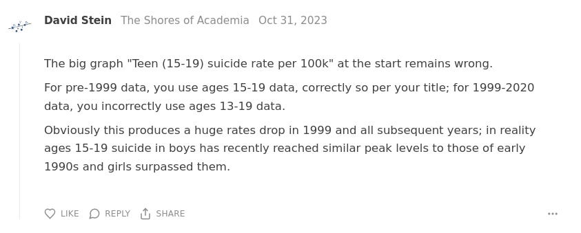
Since then I and others have repeatedly reminded Rinehart & Barkley in various ways about the error. Half of the comments under their Substack article concerns the error, for example:
To this day (Jan 31 2024), the egregiously erroneous graph in their Substack article remains unfixed and Barkley has added no warning to the article on his site so as to at least alert readers that the graph is terribly wrong.
Needless to say, Rinehart keeps merrily on tweeting and posting, so it’s not like he’s in a coma after being hit by a drunk driver. The scholarly responsibilities of Rinehart and Barkley, however, might as well be in a coma.
Note: No, there’s no such word as comatology — but perhaps there should be.
Epidemiology of Error
In December the Rinehart graph was reprinted in a National Academies report as Figure 1-4.
Subsequently, I found out it was also reprinted in the New York magazine’s Intelligencer (way back in March 27, 2023 in fact).
Neither Rinehart nor Barkley are psychologists or public health experts, and the graph was published in a mere blog post, not in a peer-reviewed journal.
One would hope that a news and analysis source as prestigious and influential as the Intelligencer would check the veracity of the graph, but the New York magazine is not exactly well-known for its fact-checking procedures, unlike its rival The New Yorker.
It is a bit shocking, however, that the Rinehart graph was published by the National Academies Press — one of the most esteemed scientific institutions in the country.7
Barkley’s Substack site is rather obscure, perhaps even more obscure than my own site is, judging by the minimal number of comments and likes under the posts there. That was one reason I did not make sure they fixed the graph after Barkley acknowledged my report of the error. And it was one reasons it did not occur to me to check if the graph has been re-published elsewhere when I found out in October it is still unfixed.
Lesson learned — never under-estimate the power of misinformation to spread, no matter how humble its origins.
Ethics of Error
There can be serious consequences to scientific misinformation.
The egregiously erroneous Rinehart graph undermines concerns over the youth suicide crisis. Suicide prevention efforts depend on funding, research, and public awareness. Key policy makers on public health have likely seen the erroneous graph on the New York magazine site or in the National Academies report.
Per my communications with Barkley and with the National Academies, neither Rinehart nor Barkley warned the Academies that there is a grievous error in the graph when the Academies asked for permission to publish the graph.
As far as I can tell, neither Rinehart nor Barkley took any steps to warn New York magazine that there is an error in the graph — and so the graph reprinted in the online Intelligencer article has continued to severely misinform readers for at least 10 months after its publication.8
The scholarly conduct — indeed misconduct — of Rinehart and Barkley is inexplicable to me. Their article about suicide trends was severely flawed in several ways but it was not disrespectful, zealous or dogmatic — the kind of qualities that would signal to me the inability to admit error or an indifference toward inadvertently spreading misinformation.
That is another lesson for me — no matter how nice and reasonable people may seem, never simply presume they will do the right thing in science even if — especially if — the stakes are scientific integrity.
Update Feb 1: I received email from Will Rinehart expressing regret for the graph error and delays and indicating the steps he is taking to correct the graph and its copies. That’s great news!
Update Feb 1: I received email from Eric Levitz that he no longer works at New York magazine but that he’ll try to get them to update his article ASAP. Thanks Eric!
See Adolescent Suicide Nonsense in National Academies Report for some details; I might address this section of the National Academies report fully in a future article.
The somewhat different age trends of suicide in adolescence between boys and girls are likely caused by differences in the onset and progress of puberty between the sexes. See Child Suicide: Age and Sex for statistical details.
Barkley is Director for Technology and Innovation at Utah State University’s Center for Growth and Opportunity.
I indeed investigated the ICD versions issue when I created historical graphs of suicide trends back in 2020 — see The Rise In Historical Context for details.
There was only a slight increase from 10.6 in 2020 to 10.9 in 2021 for teens aged 15-19.
I might address the culpability (and the response) of National Academies in a separate article.
I’m awaiting a response from the New York mag or journalist Eric Levitz on this matter.


Dr. Stein's recalculations are correct and should be used by other authors; congratulations for catching the error. However, there is another big caveat. "Teen suicide" rates prior to 2000 are suspect for a different reason. The 1950-1990s era has seen a massive trend toward reclassifying teenage deaths formerly ruled as "accidents" or "undetermined as to intent" as suicides as medical examiners' forensic examinations have improved. For example, in 1970, more than 2,000 teenaged deaths from firearms, poisonings, and hangings were classified as accidents or undetermined; by 2000, that total had dropped by two-thirds as certified suicides among teens rose in tandem. Pre-1990s teens had considerably higher true suicide rates than official figures reflect; see: https://onlinelibrary.wiley.com/doi/abs/10.1111/j.1943-278X.1991.tb00948.x This, of course, does not detract from Dr. Stein's point regarding the 2010s National Academy's misreported suicide rates.
Coming up, thanks for interest. I'm going to upload some trends soon that are deeply disturbing.